When a surf camp evolves beyond its modest origins — yet remains as rad as ever.
client
Witch’s Rock Surf Camp
work
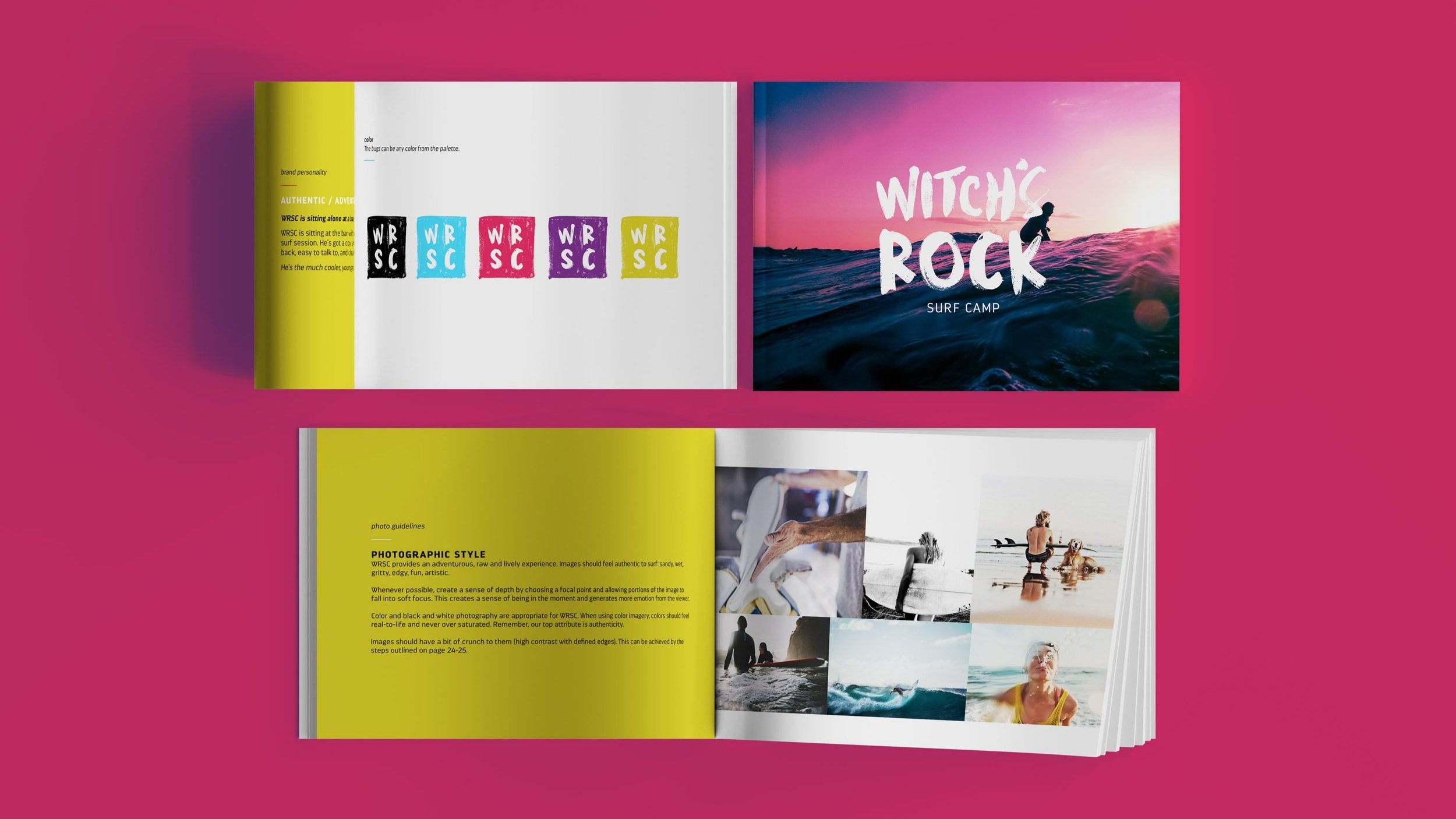
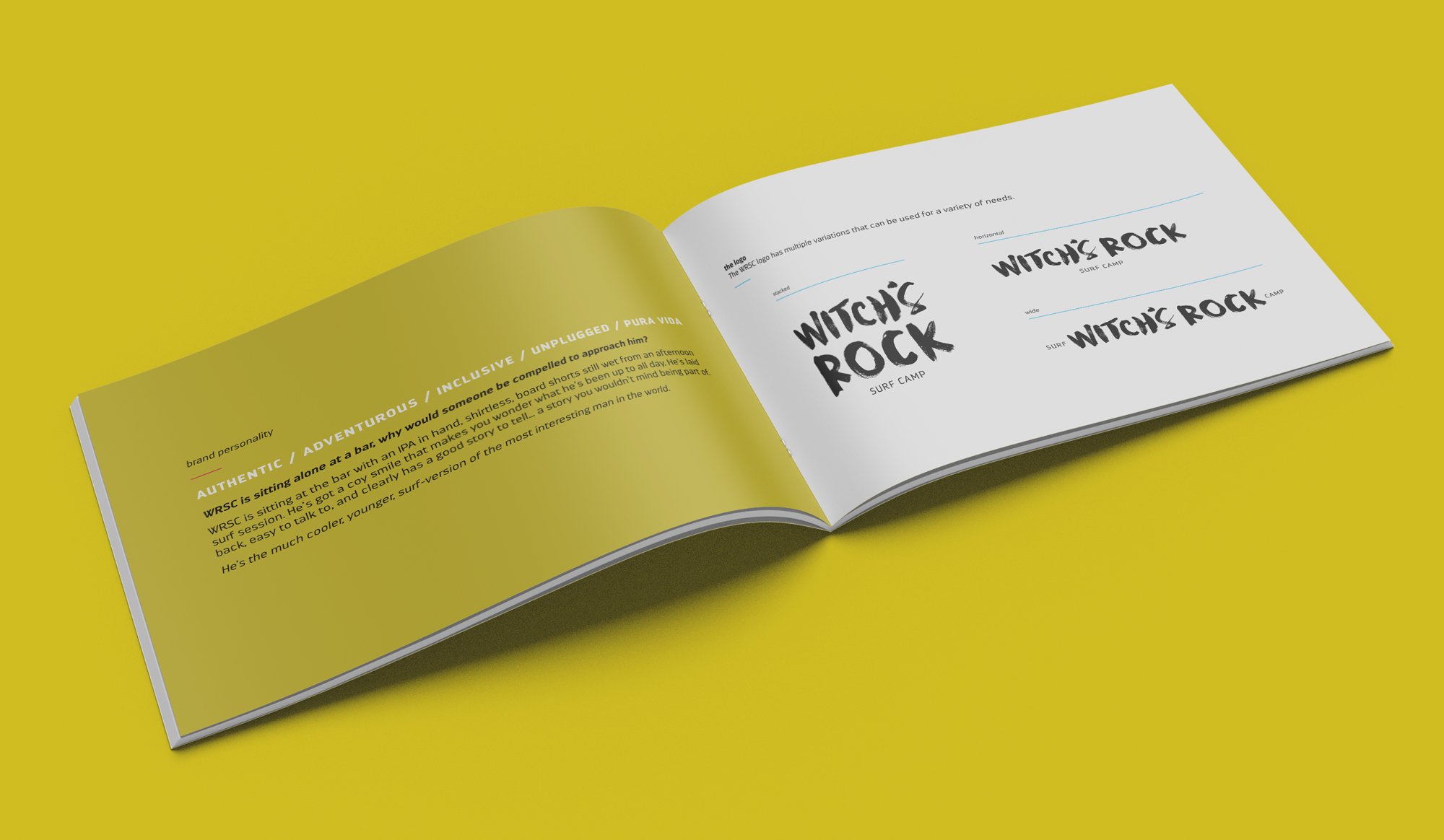
Brand development / Identity design / Brand guidelines / Photo guidelines
Witch’s Rock Surf Camp (WRSC) had grown into a revered and esteemed surf haven in Costa Rica. Yet, their brand wasn’t quite riding the same wave as their evolution. The rebrand’s mission: to crown WRSC as the champion of Costa Rica’s surf scene, all while staying loyal to their core spirit.
project details
-
Established surfers, novice surfers and the surf-curious. Guests who want to experience Costa Rica at it’s most authentic.
-
Focus on the authenticity of Witch’s Rock Surf Camp and the brand story. Not only is their origin story truly awesome — in 2001 Joe Walsh convinced nine of his friends to drive in a school bus from San Diego to Costa Rica where he opened WRSC — they now employ over 100 local Ticos. Every aspect of the WRSC experience from the local surf instructors, the on-beach showers, and the sand in between your toes at dinner, speaks of authenticity.
-
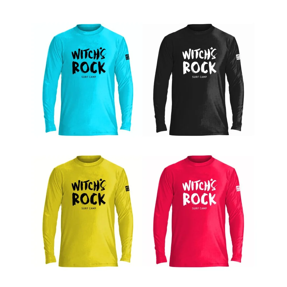
A lasting and flexible brand identity system that captures the spirit of WRSC — raw, salty, sandy, wet, gritty, edgy, fun, artistic. It’s not always neat and predictable, but it’s always an adventure.
The WRSC brand and photography guidelines were integral to the launch of the rebrand. In true WRSC form, the client wished to work with local vendors in Costa Rica to implement their brand.


